As a web developer need to use web console time to time to inspect any website and to make this easier and to get most out of it, Here we are taking 10 most cool browser features only for you.
So now without wasting any time, let's go to the main point.
Opening the browser console
Now you are just started thinking that why are you showing us to open the browser console that we already know?It's because we are going to see it from the starting.So it makes us easier to go step by step.
In the normal way, we right click on any object and select inspect.But in many cases, right click is disabled.So then you can go for a shortcut Ctrl+Shift+I.(use in Cmd+Opt+I Mac) Or as I had seen in some cases, the keyboard shortcut is not working, then just go to the top right of the browser window and click on the menu >> more tools >>Developer Tools.
Right-click on any page element and select Inspect Element.But it seems a little crazy.Any easier option is there?Absolutely yes!
1.SELECTING A PAGE ELEMENT
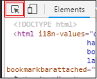 By single click, it will be enabled and then let you check the elements on that page just by hovering the mouse and selecting it by clicking.By double click, this will be disabled.
So now without wasting any time, let's go to the main point.
Opening the browser console
Now you are just started thinking that why are you showing us to open the browser console that we already know?It's because we are going to see it from the starting.So it makes us easier to go step by step.
In the normal way, we right click on any object and select inspect.But in many cases, right click is disabled.So then you can go for a shortcut Ctrl+Shift+I.(use in Cmd+Opt+I Mac) Or as I had seen in some cases, the keyboard shortcut is not working, then just go to the top right of the browser window and click on the menu >> more tools >>Developer Tools.
Right-click on any page element and select Inspect Element.But it seems a little crazy.Any easier option is there?Absolutely yes!
 |
| Chrome's developer tools |
1.SELECTING A PAGE ELEMENT
As seen in above picture, there is a button on console window's top left as shown below.
 By single click, it will be enabled and then let you check the elements on that page just by hovering the mouse and selecting it by clicking.By double click, this will be disabled.
There is an also keyboard shortcut.That is Ctrl+Shift+Cfor enabling and disabling this tool.
2.BREAK ON...
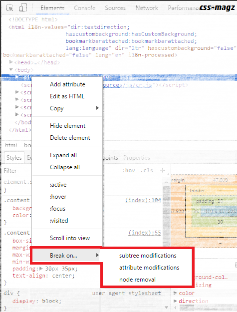
Whenever you want to break the operation, for eg a number is changing and you know that this is changing by javascript.But you want to see from raw which part the code that is changing the text.You can see the pink portion get blinked, whenever the tag, attribute or their values changes.'Break on' is also called DOM change breakpoint.
Now, in the break on, there are three options available.Just right-click on any element in chrome's developer tools and select any of the element.You'll get 3 options-
1.Subtree Modifications
Pulses Javascript code when there are changes in the subtree of that particular an element.After turning the option, you'll see the tiny blue dot has appeared at the side of the selected element.
The above options will be triggered when the javascript make a change in the selected element.Well, there are many types of breakdowns even for Javascript code for a special or particular event as discussed here.
3.TESTING RESPONSIVE & DEVICE SPECIFIC VIEWPORTS
The button just at the right side of 'select the page element' button does all this trick.Just click on that button. You'll find that your screen is just gone small.That's the device specific screen you can make like small mobile device and check the responsiveness of your website.
The good point is you can test the responsiveness of your site.Your preferred settings are saved so you can easily access them next time.
Note that- This device mode is not a replacement for the actual device.You have to be aware of its limitations.
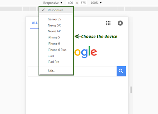
You have two modes of control in viewport toolbar.Responsive and specific device.Responsive makes the screen resizable and specific device locks the resizing of the viewport.It makes the viewport size same as the specific device you have chosen.
4.CAPTURING SCREENSHOTS IN MOBILE VIEW
Without going on mobile for screenshotting, you can get screenshots of any of the web pages on Google chrome itself.No matter which device and the size is.
1.Hit ctrl+shift+M while the insect window is open.(or click the Toggle device toolbar button).
2.Choose the device in viewport control.
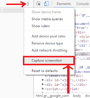
3.Click the three dots or more options and click on capture screenshot.
5.FINDING THE COLOR CODE
Many times we fall in the love of combination of colors used in the different awesome websites.The colour manager of chrome dev tools makes easy to get exact HEX or RGBA colours of any item even of a picture on the web page.
All you need to do is click on the square box in front of any colour in the styles.
Whenever you want to break the operation, for eg a number is changing and you know that this is changing by javascript.But you want to see from raw which part the code that is changing the text.You can see the pink portion get blinked, whenever the tag, attribute or their values changes.'Break on' is also called DOM change breakpoint.
Now, in the break on, there are three options available.Just right-click on any element in chrome's developer tools and select any of the element.You'll get 3 options-
1.Subtree Modifications
Pulses Javascript code when there are changes in the subtree of that particular an element.After turning the option, you'll see the tiny blue dot has appeared at the side of the selected element.
 |
3.TESTING RESPONSIVE & DEVICE SPECIFIC VIEWPORTS
The button just at the right side of 'select the page element' button does all this trick.Just click on that button. You'll find that your screen is just gone small.That's the device specific screen you can make like small mobile device and check the responsiveness of your website.
The good point is you can test the responsiveness of your site.Your preferred settings are saved so you can easily access them next time.
Note that- This device mode is not a replacement for the actual device.You have to be aware of its limitations.
You have two modes of control in viewport toolbar.Responsive and specific device.Responsive makes the screen resizable and specific device locks the resizing of the viewport.It makes the viewport size same as the specific device you have chosen.
4.CAPTURING SCREENSHOTS IN MOBILE VIEW
Without going on mobile for screenshotting, you can get screenshots of any of the web pages on Google chrome itself.No matter which device and the size is.
1.Hit ctrl+shift+M while the insect window is open.(or click the Toggle device toolbar button).
2.Choose the device in viewport control.
3.Click the three dots or more options and click on capture screenshot.
5.FINDING THE COLOR CODE
Many times we fall in the love of combination of colors used in the different awesome websites.The colour manager of chrome dev tools makes easy to get exact HEX or RGBA colours of any item even of a picture on the web page.
All you need to do is click on the square box in front of any colour in the styles.
Select dropper.Place it on any item and click on it.Now you'll see that the colour code is available right in the colour manager.
the two arrows at its side switch the HEX to RGBA.
If you liked this post, do follow my Facebook page because it is only the first part.Next part is coming soon covering the more items.




0 Please Share a Your Opinion.:
Comment something useful and creative :)