1.1 HUE ROTATION
This filter will apply a hue rotation on your images. The parameter (passed as an angle) will determine the number of degrees around the color circle the images will be adjusted.0 deg is default, and represents the original image. Maximum value is actually 360 deg.(because original image shoes at every 0 deg,360 deg,720 deg ,1080 deg etc.)
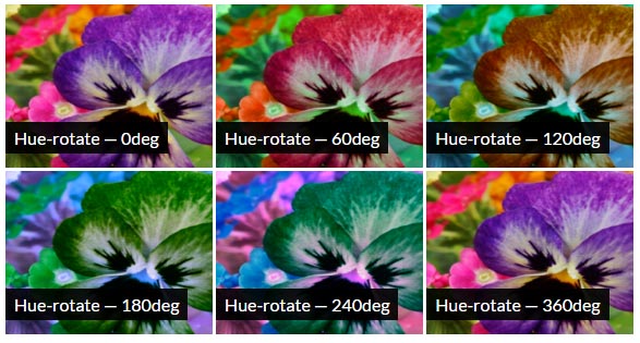
Negative values are supported and work same as that of positive values.
1.1 BROWSER SUPPORT
Blur filter property supports chrome 53.0 -webkit- , MS edge 13.0+, Mozilla firefox 35.0+,Sufari 9.1 and Opera 40.0 -webkit-.
The filter property is not supported in Internet Explorer, Edge 12, or Safari 5.1 and earlier.
1.2 USING HUE ROTATION FILTER
default value of filter css property is none.Syntax for applying hue rotation filter is -
img {
    -webkit-filter: hue-rotate(90deg);
    filter: hue-rotate(90deg);
}
In above css code , Hue is rotated by 90 degrees.
--Feel free to do experiments with below fiddle.--
1.3 INVERT CSS PROPERTY
We see inverted filter in many photo editors.Now,if you want to add inverted photo to your webpage, just do it with CSS.Syntax for making image inverted is-
img {
    -webkit-filter: invert(100%);
    filter: invert(100%);
}
0% is least and 100% is maximum value for invert.Negative values are not allowed.50%makes image fully Gray colour.In above css code,image is inverted 100%.
--Feel free to make changes in below code--
Please Make sure that you have subscribed our blog,as we will bring some great articles for you.


0 Please Share a Your Opinion.:
Comment something useful and creative :)